Data visualization is a powerful tool that helps organizations gain the ultimate business advantage. By using data insights and interactive visual representations of information, a business can quickly recognize patterns. Therefore, modern enterprises increasingly leverage the benefits of data visualization to develop visual reports that tell stories, enabling users to analyze and share information effectively.
Using pictorial representation such as interactive dashboards, graphs, maps, and reports makes it easier to understand complex data and enhances communication and collaboration within an organization. According to a recent report, the global data visualization market is set to reach $19.20 billion by 2027[1], up from $8.85 billion in 2019.
Keep reading to discover how the advantages of data visualization can help you uncover hidden insights and make data-driven decisions that drive business growth.
What is Business Data Visualization?
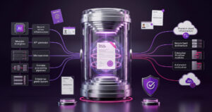
Business Data Visualization (BDV) is less about pretty charts and more about creating a command center for decision-making. Think of it as “turning data into a boardroom dialect” where complex metrics are distilled into visuals that reveal patterns, risks, and levers of growth at a glance. For leaders, BDV functions as a single pane of glass where revenue health, operational stability, and customer signals converge in real time. For technology teams, it rests on the discipline of a governed semantic layer, role-aware security, and architectures that scale without breaking trust. As the proverb goes, “What gets measured gets managed but what gets visualized gets acted upon.” Done right, BDV doesn’t just inform; it compresses the distance between data and decisive action.
Why Data Visualization Is Essential in Modern Data Analysis?
Decisions that once took weeks of back-and-forth discussions, endless reports, and layers of confusion can now be made with crystal clarity. The reason? Data visualization.
What leaders once struggled to uncover through long hours of digging is now right in front of their eyes patterns, risks, and opportunities displayed clearly, ready for action. Instead of searching through countless spreadsheets, they can focus on the conversation that matters: what does this mean, and what do we do next?
Modern businesses are moving faster than ever compared to traditional ones, whether in operations, workflows, or digitalization. To keep pace, they rely on visuals that simplify information: graphs, charts, and maps that turn complexity into clarity. From a single dashboard, leaders can access multiple visualizations, compare metrics easily, and uncover insights without digging through endless reports.
The result is smarter decisions, quicker moves to lead the market, and the ability to leave competitors behind. More importantly, these dashboards tell the story that really matters—pulling together signals from finance, operations, customers, and beyond into one clear narrative.
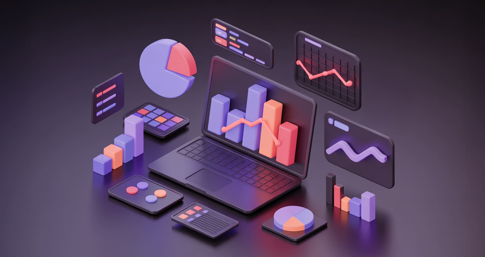
Types of Data Visualizations and their Unique Benefits
Here are the different types of data visualizations and their key benefits, each with its own way of unlocking insights, catering to specific needs, and adding value.
1. Line Charts
Line charts are most effective for showing changes over time, such as revenue growth, temperature variation, or user adoption rates. A SaaS company tracks its Monthly Recurring Revenue (MRR) using a line chart visualizing growth from $250K at the start of the month to $265K by month’s end, a 6% increase.
Benefits:
- Quickly reveal growth, decline, and seasonality
- Easy to compare multiple timelines side by side
- Highlight anomalies (spikes, dips) instantly
2. Bar & Column Charts
Bar and column charts compare categories at a glance, ideal for sales by region, product performance, or departmental expenses. Businesses can “gain a competitive advantage by leveraging bar graphs to analyze and visualize data that highlight opportunities and trends
Benefits:
- Clear side-by-side comparisons
- Handles large datasets without losing readability
- Highlights leaders and laggards instantly
3. Heatmaps
Heatmaps represent data intensity with color gradients, making dense information intuitive. The U.S. Marine Corps, in collaboration with The Hive Group, used a treemap within their MERIT system to monitor supply chain operations. This visualization helped identify delays, high failure rates, and low equipment readiness
Benefits:
- Turns dense data into intuitive visuals
- Identifies concentration zones at a glance
- Useful for performance monitoring and optimization
4. Scatter Plots
Scatter plots highlight relationships between two variables perfect for identifying correlations and outliers. In Learning & Development (L&D), scatter plots reveal relationships like how time spent in training correlates with performance improvements across employees—helping pinpoint effective programs or outliers needing attention
Benefits:
- Exposes correlations or lack thereof
- Highlights outliers that skew averages
- Supports deeper predictive modeling
5. Pie & Donut Charts
These charts show proportions of a whole, best used with fewer categories. Market research firms often use pie charts to illustrate market share, e.g., brand breakdowns like Apple, Samsung, Huawei, making the competitive landscape instantly clear to investors and analysts.
Benefits:
- Simplifies share-of-whole communication
- Works well for high-level executive views
- Easy to digest in presentations or reports
6. Treemaps
Treemaps visualize hierarchical data through nested rectangles, ideal for resource allocation or portfolio analysis. The Hive Group’s treemapping applications are used by the U.S. Marine Corps supply chain system (MERIT): across 2,500 daily users, treemaps help detect delayed shipments, failure rates, and readiness issues through visual hierarchy.
Benefits:
- Displays hierarchy and proportions together
- Useful for drilling down into categories
- Space-efficient for large, complex datasets
Data Visualization Benefits
When implemented correctly, data visualization helps decision-makers in several ways, such as improving data insights. Here are some of the key business benefits of data visualization.
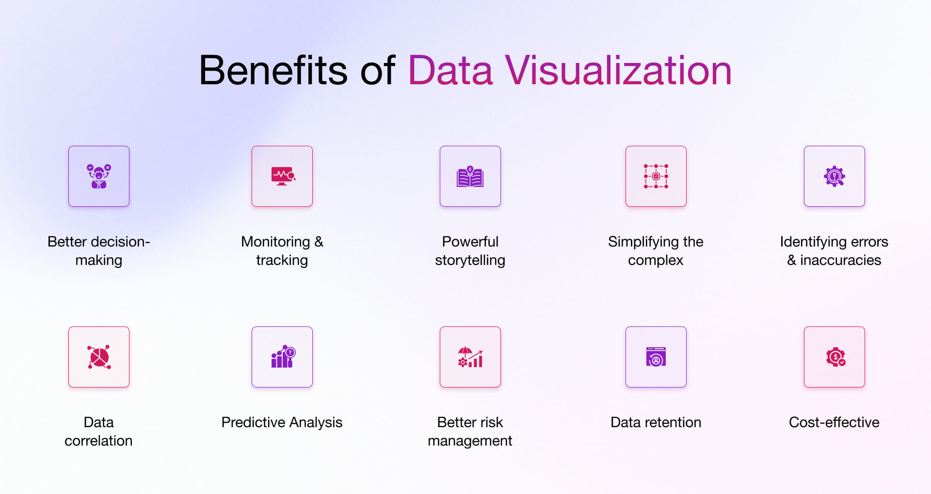
1. Better Decision-making
By presenting information in the form of intuitive and interactive visualizations, this innovative technology helps your business support data-driven decision-making. It makes complex datasets more accessible and understandable for everyone throughout the organization. Since visual content is processed much faster, users can quickly identify key insights through rich visuals. It ultimately promotes collaboration and communication in decision-making that moves your business towards better business decisions and growth.
2. Monitoring and Tracking
Data visualization dashboards and reports provide real-time monitoring and tracking capabilities in various industry domains (like business intelligence, finance, and operations). These visual representations allow stakeholders to:
- Quickly identify trends, patterns, and relationships
- Monitor key performance indicators (KPIs)
- Take timely actions based on the visualized data
- Easily share information
3. Powerful Storytelling
The purpose of the dashboard is to promote data stories for a better understanding of data. Storytelling is one of the primary benefits of data visualization, and it helps your target audience catch the right message through a story in a visual manner.
4. Simplifying the Complex
Data generated from various disparate sources and in different formats can often overwhelm the users. However, Data visualization can break down complex data into easily understood digestible chunks. Visual elements such as charts, graphs, and maps transform complex data into clear and concise visuals. It enables anyone, from salespeople to CEOs, to benefit significantly from the ability to quickly grasp the pulse of the organization at the right time.
5. Identify Errors and Inaccuracies
Effective visualization helps spot errors in the data quickly and easily. It also saves time as you can eliminate errors from the analysis at a faster pace and ensure the accuracy of the extracted outcomes. This proves to be one of the significant business benefits of data visualization.
6. Data Correlations
Through heatmaps and scatterplots, visualization can reveal hidden correlations and dependencies. By arranging several data sets on one map or chart, business users can recognize relationships and patterns between the data and, by exploring these patterns, can focus on specific areas to move business forward.
7. Predictive Analysis
Various advanced data visualization tools like Tableau, Power BI, and Qlik Sense make it easier to identify patterns and trends and even reveal outliers. This can help you predict future trends based on historical data. Through this, you can forecast:
- Sales and Demand
- Market trends
- Customer demographics
- Potential success of a new product launch
- Various other important business metrics
8. Better Risk Management
Data visualization tools can be used to create dynamic dashboards that automatically update constantly, allowing for continuous monitoring of critical metrics. This enables proactive risk management and facilitates efficient decision-making in response to changing circumstances.
9. Data Retention
Data visualization makes information easier to remember. When insights are shown as clear visuals instead of raw tables, leaders and teams retain critical findings longer. This strengthens knowledge transfer, supports faster recall in meetings, and ensures key insights are not lost in the noise.
10. Cost-Effective
Visual dashboards reduce the time and resources spent on manual reporting. By simplifying analysis, they cut down the cost of decision-making cycles and minimize errors. For mid-market companies, this means smarter use of budgets and higher returns on data investments.
Industry-Specific Benefits of Data Visualization
Now that you have a clear understanding of the common data visualization benefits, let’s explore how this innovative technology positively impacts various industries.

Manufacturing
- Identify production bottlenecks and areas for improvement
Real-time performance tracking lets manufacturers quickly identify delays and inefficiencies slowing down their production lines. Thus, companies can know when to act on any arising issue based on this information. This helps them visually see specific points that could be improved, like machine usage rates, cyclic periods to particular machines, or quality control measures. This will help enhance those critical areas of the process, leading to a smoother flow of operations and increased output. - Monitor machine performance and predict maintenance needs
This robust technology can track IoT sensor data from machines and help manufacturers anticipate equipment failures in advance. This proactive analysis can prevent downtime and ensure that machines constantly operate efficiently.
AdTech
- Understand campaign performance and optimize ad placements
Visualizing historical campaign performance data helps companies identify effective ad creatives, formats, and messaging. These insights further help understand the demographics, interests, and behaviors of their target audience across various platforms. This allows them to optimize their campaigns by placing ads in the most effective locations and targeting the right audience. - Analyze user behavior and target audience through behavioral analysis
Visualizing user data and key metrics, such as engagement and conversion rates, helps identify common behavior and patterns among target audience. It enables adtech companies to track user behaviors on websites and apps to map user journeys. Using these data, companies can create more targeted advertising campaigns that are more likely to resonate with users. - Measure the ROI of advertising campaigns
Companies use visualization tools to create comprehensive dashboards and track the KPIs and ROI of advertising campaigns. This helps them gain better visibility of how much money they make from their campaigns and allocate budgets efficiently.
FinTech
- Uncover fraud patterns and anomalous behavior
FinTech firms can easily spot irregularities in their financial data by leveraging data visualization to monitor financial transactions in real-time. This assists in detecting fraud-related patterns, prompting them to act proactively to curb fraud and reduce associated losses. For the FinTech industry, there are various advantages to using data visualizations for such complex datasets. - Visualize financial data to gain insights into market trends
In FinTech, complex financial data can be visualized through various techniques such as line charts, heatmaps, and treemaps, among others, transforming it into meaningful visual representation. This allows companies to identify market trends that could impact their investment decision-making and help with financial forecasting and budget planning. - Create clear and concise reports for investors and regulators
Data visualization can create clear and concise reports for investors and regulators. This can help FinTech companies to communicate complex financial information in a way that is easy to understand.
Healthcare
- Enhanced patient care
Implementation of data visualization can detect regularities and features like patient response to treatment as well as the use of medication. This can aid health practitioners in recognizing patients at risk of complications or not responding well to a particular treatment, which would help them ensure better care for their patients. - Medical research
Comprehensive research can be used to analyze complex clinical trial results, track the spread of diseases, or study any other complex healthcare phenomena. This analysis can accelerate breakthroughs and improve patient care.
Retail
- Understand customer behavior and buying patterns
Each customer produces a wealth of data points in a retail environment. Data visualization helps retailers group customers based on different attributes, such as demographics and purchase history. Creating a visual representation of these segments helps retailers tailor offerings accordingly. Visualization can further help retailers map out and accurately analyze customer journey, which can help identify opportunities in product assortment strategies as well as store layouts and marketing initiatives - Optimize product placement and store layout
Viewing the data of customer traffic patterns with the product sales data in a detailed manner can assist a retail store owner in optimizing where products are to be placed. It can also help in deciding how the store layout is to be done so that customers are more inclined towards making purchases. - Forecast demand and manage inventory levels
The use of data visualization helps retailers accurately predict what products the market will demand. This allows the retail store to manage their inventory levels prudently without stockouts or overstocking situations.
Best Practices for Effective Data Visualization
77% of organizations make better decisions with data visualization but only when best practices are followed. Here are key practices of business data visualization.
1. Start with Purpose, Not Design
Effective data visualization begins with clarity of purpose. Ask: What decision should this chart enable? Who is the audience? A CEO may need high-level KPIs, while a data team may need granular drill-downs. When the objective drives the visualization, the design naturally becomes more focused and impactful.
Purpose + Audience = Design that matters
2. Keep It Simple, Keep It Sharp
Complex visuals slow comprehension. Simplicity ensures busy executives grasp insights in seconds. Remove unnecessary gridlines, decorative graphics, or irrelevant data points. White space is not empty it’s breathing room for clarity.
3. Match Chart Type to the Message
The wrong chart can mislead. Use line charts for trends, bar charts for comparisons, scatter plots for correlations. Pie charts should be avoided when showing more than three variables. Choosing the right chart ensures accuracy and credibility.
4. Use Color Intentionally
Color should clarify, not decorate. Use a neutral palette with one or two strong accent colors for emphasis. Keep color meanings consistent across dashboards (e.g., red = risk, green = growth). Ensure accessibility for color-blind viewers by using textures or contrast.
5. Provide Context and Benchmarks
A number alone lacks meaning. Always provide comparisons, targets, or historical baselines. This turns raw data into actionable insights. For executives, context is the difference between asking “What does this mean?” and acting on it immediately.
Top Data Visualization Tools
A broad spectrum of visualization tools are used across a wide range of industries. While choosing the right one depends on your requirements, here are some of the popular data visualization tools:.
Microsoft Power BI
- Power BI is a business intelligence and data visualization tool that allows users to create interactive visualizations.
- Includes built-in AI capabilities and data security features and can easily scale with your business needs.
- Best suited for businesses that are already plugged into Microsoft ecosystem.
Features
- Customizable dashboards
- Multiple data source integration
- Navigation pane
- Dataset(s) filtration
- Interactive reports
We can help you with our comprehensive Microsoft Power BI Consulting Services to extract intelligent insights and make decisions on the go.
Tableau
- Another popular and powerful enterprise-level visual analytics platform that can seamlessly integrate with hundreds of sources to import data and output dozens of visualization types—from charts to maps and more in a very short time.
- Tableau’s VizQL (Visual Query Language) allows for formulation, cleaning and arranging of data to create intuitive visualizations instantly.
Features
- Real-time analytics
- Role-based permissions
- Mobile accessibility
- Intuitive Dashboard Creation and UX
- Connect to a variety of data sources (and easily integrate with existing technology)
Apache Superset
- An open-source cloud-native data exploration & visualization tool with an easy-to-use interface.
- Provides code-free visualization builder to extract and present datasets.
Features
- Create and share dashboards
- Rich set of data visualizations
- Enterprise authentication
- Notification alerts and scheduled reports
- API for programmatic customization
- Maps and geo support leveraging Mapbox
Choose Rishabh Software To Enable Data-Driven Decision Intelligence
Our Data Visualization Services help you develop custom solutions by breaking down information silos to analyze better and enable better business outcomes. We can help you create custom data platforms, reports, and dashboards, or even analyze & enhance your existing dashboards and leverage cloud platforms to provide you with comprehensive data visualization capabilities under one roof.
Our expert data visualization specialists at Rishabh Software can help you transform your business data into actionable insights. With a collaborative approach, our team of data evangelists can create immersive dashboards & rich visuals that drive business with faster, more intelligent & informed decisions. We are well-versed in leveraging popular BI platforms like Power BI and Tableau. Whether it be technology consulting, implementation, or support to develop visually appealing and thoughtful reports, we’re your one-stop partner for all your data visualization needs.
Frequently Asked Questions
Q: What are the future trends of data visualization?
A: Here are some potential data visualization trends include:
- Increased use of augmented reality (AR) and virtual reality (VR) for immersive data visualization experiences.
- More interactive and real-time visualization of large, streaming datasets.
- Integration of natural language interfaces for easier data exploration.
- Advances in automated insight discovery and intelligent data storytelling.
- Wider adoption of novel visualization techniques like virtual data comics.
- Greater focus on accessible and inclusive data visualization for diverse audiences.
- Convergence of data visualization with other emerging technologies like 5G and edge computing.
Q: Why is data visualization Important for businesses?
A: The business benefits of data visualization are numerous. It is essential to communicate complex information and insights clearly and concisely.
Here are some key reasons why data visualization is crucial for your organization:
- Improves Understanding – The visual representations of business data make it easier for the human brain to comprehend and process large amounts of data. The charts and graphs communicate better because perhaps we, as humans, are preprogrammed to process visual cues faster than written language.
- Identifies Patterns and Trends – The old method or raw data might face information overload and overlooked challenges. Meanwhile, visualizations help to identify patterns, trends, and outliers in data that might be forgotten in numerical or textual formats.
- Communicates Insights Effectively – The presentation of data is critical when presenting in front of your customers or stakeholders. It helps companies identify improvement areas and factors affecting customer satisfaction/dissatisfaction and plan out specific product strategies. Further, a well-designed visualization plan goes beyond presenting historical data and enables users to create what-if scenarios to make data-driven decisions for higher sales volumes and future growth.
- Saves Time and Effort – Visualizations can quickly convey information that would otherwise require extensive reading or analysis of raw data. Also, it is universal, fast, and practical, which ultimately saves your time and effort.
Footnotes:
1. https://www.fortunebusinessinsights.com/data-visualization-market-103259