It is essential to decipher and utilize data for business growth in this digital space. And with the rapid evolution of CIoT and the adoption of IIoT across industries, there is an immediate requirement to derive valuable insights from the immense data that IoT devices collect. The massive amount of data generated by IoT devices is useless if the unstructured data sits in a database and is not organized in a processed database format.
Whether it is consumer IoT data or industrial IoT data, businesses require specialized tools to process and analyze the volume, velocity, and variety of telemetry data from disparate sources. This is where IoT visualization tools, from Grafana and Tableau to IBM Watson to Power BI and Kibana, can help you connect and correlate things.
Read on to learn more about the concept of data visualization in IoT and how it helps businesses and industries make sense of the large amount of data transmitted and ingested through IoT devices. So, let’s begin!
What is IoT Data Visualization?
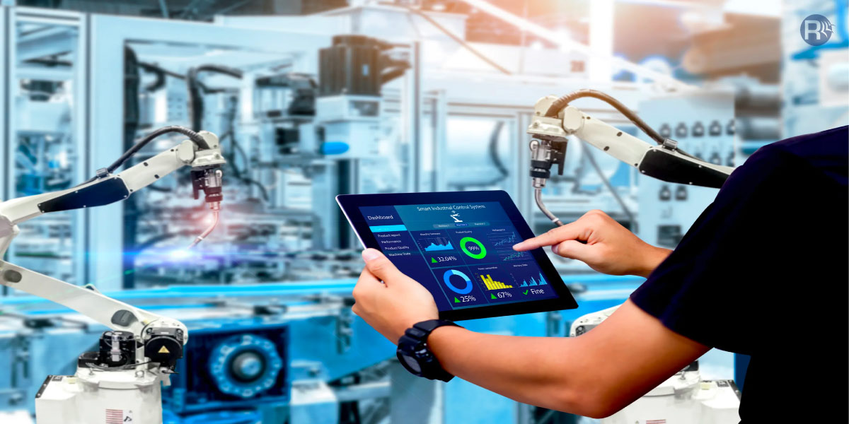
IoT Data Visualization is the process of utilizing varied visualization techniques to make sense of the data collected by IoT devices. You can use different types of maps, graphs, and charts to interpret data captured from IoT sensors. Advanced visualization techniques and platforms can provide interactive visualizations and the facility to adjust parameters in real-time, which is essential to visualize IoT data.
Did you know?
The global data visualization market is expected to grow at a CAGR of 9.69% between 2023 and 2028[1]. Amongst the key industry segments, the retail industry will witness significant growth. Retailers are adopting data visualization to understand and analyze consumer patterns and purchase behavior to make data-driven, informed decisions ahead of customer expectations.
How Does IoT Data Visualization Help Across Businesses and Industries?
Consumer IoT and Industrial IoT connected devices constantly capture exponential data, which needs to run through IoT visualization tools to extract insights and enable data-driven decision-making. Let’s explore the use of IoT data visualization across different industries.

Transportation
Today smart cities are relying on data visualization tools to analyze the data captured from multiple sources and IoT sensors. Routing transportation networks within cities and public transport places is highly challenging. Data visualization helps identify trends and patterns in data clusters for city traffic police to streamline operations.
IoT data visualization tools merge different data points to interpret deeper insights and trends. Manchester Airport – one of the busiest airports in Britain[2], also uses Power BI dashboard to collaborate, connect and share information seamlessly in real-time.
If you are interested in exploring the role of IoT in Transportation, check out our informative piece of content.
Agriculture
With the increasing use of IoT sensors in the agricultural sector, farmers can monitor significant indicators like weather and soil conditions, irrigation systems, and many more using geospatial data visualization techniques. So, such visualizations allow them to optimize critical farming activities like soil regeneration, irrigation, pesticide application, and smart harvesting. By setting optimal parameters, smart farming helps in maximizing crop yield.
Logistic
Logistics industry leverages IoT technology and data visualization dashboards to efficiently maps routes, track & trace shipments in real-time, and ensure timely cargo deliveries. They also use heatmaps to identify hotspots of areas where the company makes sales and constantly receives orders. Choropleth[3] maps help visualize the area-wise percentage of goods sold against the stock. It allows businesses to know in which regions they are performing better. Additionally, they utilize flow maps and symbol maps to monitor the movement of goods and manage inventory accordingly.
Healthcare
IoT visualization tools help medical practitioners to make informed decisions for their patients. Medical practitioners can obtain critical medical data of their patients via IoT sensors, and visualization helps them provide accurate diagnosis and treatment. It also helps analyze the accessibility of medical services in a particular region. Researchers can conduct different studies based on demographics, diseases, availability of drugs, etc. With IoT in the healthcare industry, it is convenient to identify medical data trends and offer advanced and personalized treatments to patients.
Retail
Interactive visualizations help the retail industry address challenges, optimize its supply chain, and identify consumer behavior trends. Retailers can leverage IoT potential to identify growth opportunities and reduce operational costs. By conducting income-based demographic analysis, they can better estimate if your product can find a market in a particular region. It helps them create an accurate user persona for their products and services and personalize them to suit their target customers. If you are interested in exploring how IoT in inventory management is helping businesses to optimize inventory management, check out our in-detail guide.
Environment
Public service companies and environmental ventures leverage geographic information systems and maps to formulate actions and strategies for risk reduction. By visualizing data collected by IoT devices, ecological professionals can identify patterns and the cause of environmental phenomena. It helps them create actionable solutions for their projects.
Best Practices for IoT Data Visualization
You can optimally utilize IoT data analytics and visualization to meet your business needs and objectives. They include:

Defining Accurate KPIs
To ensure that the outcome of your IoT visualization is relevant to your business needs, you must align it with clear objectives and KPIs. Selecting the right KPIs and metrics ensure that the visualizations provide meaningful insights into the relationship of the business with its goals, progress, and challenges.
For example, if you want to monitor a manufacturing equipment’s performance, you should measure KPIs like throughput, yield, and uptime. You can set expected metrics and compare them with the actual ones. The graphical representation will show how close or far is your equipment’s performance to your expectations.
Utilize The Correct Visualization Technique
There is no one-size-fits-all approach; a particular visualization technique works better in a specific situation than others. So, be mindful of choosing suitable chart types, labels, and colors that best represent the data and help the intended audience easily interpret the data. For example, when trying to showcase the humidity and temperature level in the greenhouse’s different sections, it is advisable to use a color-coded map. It makes it easier to identify areas with abnormal moisture or heat levels.
Consider the Audience
An effective IoT data visualization dashboard must communicate with the target audience, or else it couldn’t be useful. You must consider the level of subject matter technical expertise and the requirements of your audience. It allows you to design the dashboard to communicate better so that they easily understand and interpret the data visuals.
Ensure Data Quality and Accuracy
Before utilizing a data set for analysis and visualization, it is important to ensure its accuracy and relevance. Failing which, the results of visualization can’t be reliable. For example, you are trying to derive the sales trend of a particular product but have failed to incorporate data from a significant demographic. It could result in missed opportunities for the business.
Keep the Visualizations Intuitive Yet Straightforward
Ideally, an IoT data visualization should provide a quick at-a-glance overview of key information. Ensuring simplicity in every component of data makes it easy to grasp and avoid confusion and misinterpretation. Therefore, your visuals must be easy to understand, intuitive, and straightforward. Complex visualizations could confuse your audience and fail to serve the purpose. Also, cluttering the visualization with too much unnecessary data is not a good idea.
Personalize Your Dashboards
You can have multiple dashboards designed to serve the varied business goals and objectives of different business units and departments. Giving role-based access to relevant information keeps the data visualization simple yet effective. And you can design custom dashboards that measure relevant KPIs and deliver insights to help the team make informed decisions. For example, the logistics department may be interested in the routes of a specific region. At the same time, HR may be interested in its population’s education level to reach potential hires.
Create Visual Cues to Highlight Data
Visual cues help highlight important data and direct the attention of the user. Creating a distinct collection of symbols as visual cues helps communicate the information more efficiently with the audience. In a way, it is filtering and highlighting key data from the large volume of data displayed in IoT visualization.
Enable Real-Time Parameter Inputs
Enabling real-time parameter input lets users explore the data to match their needs. With variables or parameters, you add interactivity and flexibility to your IoT data visualization. It allows users to dynamically explore data from different perspectives and scenarios and gain deeper insights. This best practice proves to be valuable in the organization’s efforts to optimize operations and cut costs.
Improve Data Shareability and Communication
The various departments within your company or employees working in different locations can stay on the same page by sharing their data visualization results. The feature to export visuals and share them securely within or outside your organization is handy in enhancing overall business efficiency.
Common Challenges in IoT Data Visualization and How to Address Them
While the IoT data visualization platform helps all shapes and sizes of businesses across industries become more data-driven, it does not come without challenges. You can overcome these limitations with guidance from skilled IoT experts. We have compiled a list of common challenges and how you can address them for visualization success.
Skill Gap
As most IoT data visualization use cases demand real-time operational insights, there is a need for individuals with expertise in ML, data science, and data visualization. The race for AI has pushed the demand for such talent and individuals with these skills are hard to come by. Moreover, since the area of IoT data analytics and visualization too is an unchartered territory, there is a lack of proper formal training.
Oversimplification of Data
The purpose of data visualization is to simplify complicated datasets. Pictorial representations may sometimes miss out on incorporating crucial data aspects. Here you need to make sure that your team is skilled and experienced to avoid such pitfalls in visualizing IoT data.
Poor Data Quality
The end user does not find value in the raw data captured from IoT sensors but rather in the ease with which IoT data visualization generates meaningful insights for easy interpretation. The sensors are, thus, the fundamental component in generating raw data quality, as it can highly influence the accuracy of your analytics and visualization outcomes. You must ensure that to utilize reliable, up-to-date, and accurate data. It is essential to check the data sources consistently for their reliability and undertake processes to keep the data error-free and relevant.
Erroneous Algorithms
Machine Learning algorithms form an integral part of data visualization. They process data sets based on their inherent logic and convert them into visuals. So, the input of algorithms determines the output of data visualization efforts. And if the algorithm misses capturing relevant information, you may get only a one-sided view of data. To avoid such pitfalls, it is essential to use high-quality visualization tools.
Why Partner with Rishabh Software for IoT Data Visualization?
Merely collecting large volumes of data from IoT devices is not enough. You need to put it to productive use. You need reliable data analytics and visualization services experts to get it right. We are a proficient and most-trusted IoT solutions development partner also known for implementing data visualization across business verticals to improve your operational efficiency.
Our data expert team can help you visualize, interpret, and derive valuable insights from massive and complex datasets. As a leading data visualization company, we also lend a helping hand in popular BI platforms like Power BI and Tableau.
Our Success Story:
ELD Fleet Management Mobile App Development

Our client from the logistics and supply chain management industry in the US wanted to track cargo and commercial drivers in real-time to manage the fleet effectively. We developed a fleet management mobile app that collects data from IoT-based sensors, analyzes it, and provides intuitive reports with valuable insights. Our team also developed custom IoT data visualization dashboards to meet the needs of different stakeholders.
Key takeaways:
- 100% automation of DVIR
- 2x fleet efficiency optimization
- 62% rise in fleet profitability
Read more about how our ELD Fleet Management Mobile App Development helped the client.
Frequently Asked Questions
Q: What are the different types of IoT data Visualization techniques?
A: You can visualize IoT data in many ways. The most common ones include:
- Real-time dashboards showing important metrics like KPIs (key performance indicators), notifications, trends, and more allow you to identify and resolve issues early.
- Choropleths and heat maps provide geographic visualization of data density and per-unit area-based information for specific regions.
- Charts and graphs of different types display data relationships, patterns, and trends.
- 3D models and VR (Virtual Reality) technologies display detailed and complex IoT data in more interactive and simple visuals that is easy to understand.
- Maps and geospatial visualizations help analyze data from IoT devices spread across vast geographical areas. For instance, when using it for traffic monitoring devices or weather sensors and displaying it in a spatial context.
Q: Give Real-world Examples of IoT Data Visualization.
A: There are many interesting real-world examples of data visualization IoT that includes:
The world’s air pollution dashboard shows the real-time air quality index of different regions across the globe since 2014. Thousands of quality monitoring stations provide IoT data to visualize the map showing areas with good, unhealthy, and hazardous air quality[4].
Wabash Heartland Innovation Network uses IoT data visualization to get information on farmers’ assets and weather stations. It deploys hundreds of weather stations across the US region of Indiana and collects data via internet-connected sensors[5].
Q: How does an IoT dashboard help derive valuable data insights?
A: An IoT dashboard presents data in a visual format using several widgets like bar charts, line graphs, heat maps, geographical maps, pie charts, etc. By converting data into valuable business assets, dashboards facilitate practical insights and real-time decision-making while centralizing data from different devices and sources.
Footnotes:
1. https://www.mordorintelligence.com/industry-reports/data-visualization-applications-market-future-of-decision-making-industry
2. https://news.microsoft.com/en-gb/features/tech-is-taking-off-at-manchester-airports-group/
3. https://www.cumul.io/blog/logistics-visualization-5-maps-for-data-visualization
4. https://waqi.info/
5. https://whin.org/